How Casino Design Moves from Buildings to Screens
27 October 2026
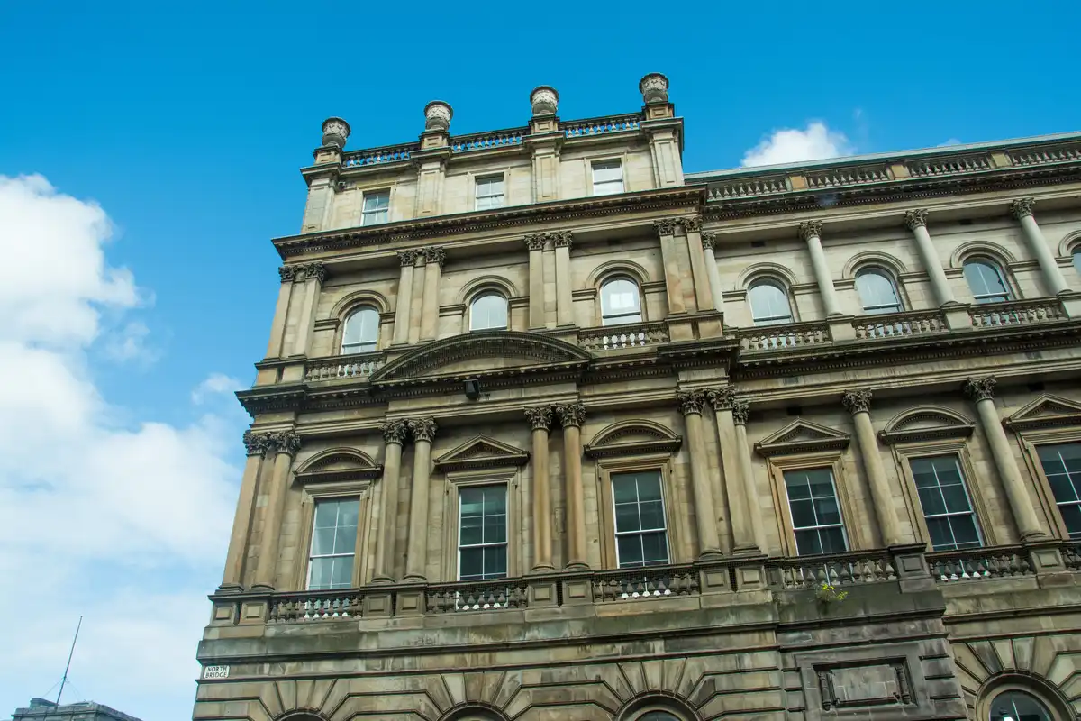
Kevin Lynch asked people in Boston, Jersey City and Los Angeles to draw their city from memory, and found that everyone drew with the same five things: paths, edges, districts, nodes and landmarks. The Image of the City came out in 1960 and it is still the most useful vocabulary an architect has for how a person finds their way through a place they did not design.
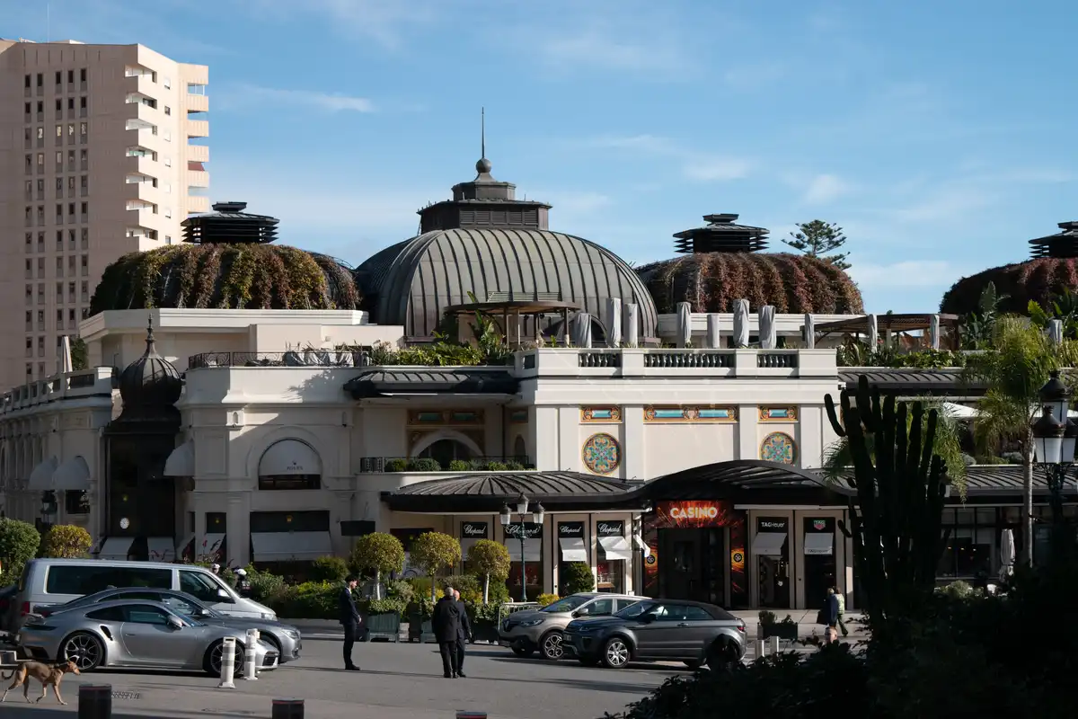
A casino floor is a city drawn deliberately. It has paths (the aisles between banks of machines), edges (the carpet changing where the tables begin), districts (slots here, cards there, the bar as its own country), nodes (the cashier, the entrance) and landmarks (the chandelier, the big wheel, whatever you tell a friend to meet you under). Put the same casino on a screen and three of the five disappear.
How Architecture Shapes a Casino Experience
The best British example of a casino as a designed environment is a Matcham theatre. At the Leicester Square end of Charing Cross Road stands the one Frank Matcham finished in 1900, an island block of five storeys with a canted, canopied corner entrance, whose Grade II listing describes the inside as an arena-form auditorium. An arena is a circle, so every seat looks at the same ring and can see most of the other seats. When the theatre reopened as a casino in July 2012, after a three-year conversion, the main gaming floor went where the arena had been, and the old stage end kept a reconstructed proscenium and a 180-seat cabaret room. The geometry a circus needed, everyone facing the centre with the tiers rising around them, is almost exactly the geometry a gaming floor wants.
Lighting and materials shape the rest. A floor is lit so the tables are the brightest things in it and the walls fall away; the carpet is patterned so that the eye does not rest on it; brass, dark wood and velvet make the edges feel expensive and the centre feel busy. A high ceiling lets the murmur of a full floor hang in the air; a low one presses it to a hum, and everything in the room points at the tables.
When the Gaming Floor Becomes an Interface
On a screen, the five elements collapse to two. The Hippodrome online casino has paths and districts and almost nothing else. Its games sit in categories you reach by menu, and the only landmark on the page is the name. Nothing on the page is an edge. The interface designer has to replace all of that with hierarchy, which is a polite word for deciding what is biggest.
Learning from Las Vegas, which Venturi, Scott Brown and Izenour published in 1972, argued that on the Strip the sign had become more important than the building behind it, and that architects should stop pretending otherwise. Online there is nothing behind the sign. Typography, a logo, a colour scheme and the ordering of a menu are the only architecture there is. Good digital design accepts that and spends its effort on the things Lynch’s subjects used most, paths that are obvious and districts that are clearly bounded, instead of trying to fake a landmark with an animated banner.
Creating Atmosphere Without a Building
An architect working on a floor has scale, texture, distance and other people. A screen designer has graphics, type, motion and sound, on a surface the size of a hand, read on a bus. The carpet pattern that keeps the eye travelling has a screen equivalent in Gestalt grouping: things placed close together read as one district, things spaced apart read as a boundary, and a designer who understands that can draw an edge with white space where an architect would have changed the floor covering.
Type weight and menu depth carry the rest: the heaviest type goes on the thing you are most likely looking for, and a lobby that needs three taps to reach a game has built a long corridor whether it meant to or not. A floor has a far end and a screen does not, and the attempts to simulate one, with endless scroll and parallax, tend to feel like a corridor with no doors.
Why Good Digital Design Needs More Than Appearance
A building can be beautiful and badly organised, and theatres often are. The Leith Theatre project has spent as much effort on who can get in as on the auditorium. A screen can be distinctive and still lose you: a striking colour scheme, an animated header, and then a catalogue you can only search by scrolling. Online, the equivalent is a menu that goes where it looks as though it goes. The test is the one Lynch’s subjects passed with a pencil, an interface you could draw from memory, and whose drawing would get you back to what you wanted.
Different Spaces, Related Design Questions
Historic England listed the Matcham theatre in January 1970, when it was a cabaret restaurant and the arena had already been altered more than once. The listing protects the shell and records the geometry, and the geometry is the part that has outlasted every use the room has been put to.
Comments on this guide to How casino design moves from buildings to screens article are welcome.
Edinburgh Architecture

Edinburgh Architectural Designs Projects

Comments / photos for the How casino design moves from buildings to screens experience page welcome.